 Entry
Entry Dashboard
 Contacts
 Properties
 Email
Email Calendar
 Tasks
Tasks Acquisition Cockpit
 Audit-proof mail archiving
 Automatic brochure dispatch
 Billing
 Groups
 Intranet
 Marketing Box
 Marketplace
 Multi Property module
 Multilingual Module
 onOffice sync
 Presentation PDFs
 Process manager
 Project Management
 Property tracking
 Property value analyses
 Enquiry Manager
 Showcase TV
 Smart site 2.0
 Statistic Tab
 Statistics toolbox
 Success Cockpit
 Time Tracking
 Address from clipboard
 Text block
 Customer communication
 External Tools
 Favorite links
 Calculating with formulas
 Mass update
 onOffice-MLS
 Portals
 Property import
 Quick Access
 Settings
 Templates
 Step by step
You are here: Home / Modules / Calendar / Calendar / Schedule overview / Calendar overview

Calendar
Calendar overview

When you click on an appointment tile, the most important information about the appointment (subject, date and time, appointment location, travel time, etc.) is displayed in a popover.
The top right corner shows whether all addresses have accepted or accepted and canceled or whether the answer is still pending. This is indicated by various icons. The status of the individual appointment confirmations is also displayed.
Double-click on an appointment tile to open the appointment detail view where you can change the appointment.
If you are in the “Appointments of a user” window, the location of the appointment is also displayed without having to move the mouse over it. This can be helpful to be able to see and take into account the current location of a user.

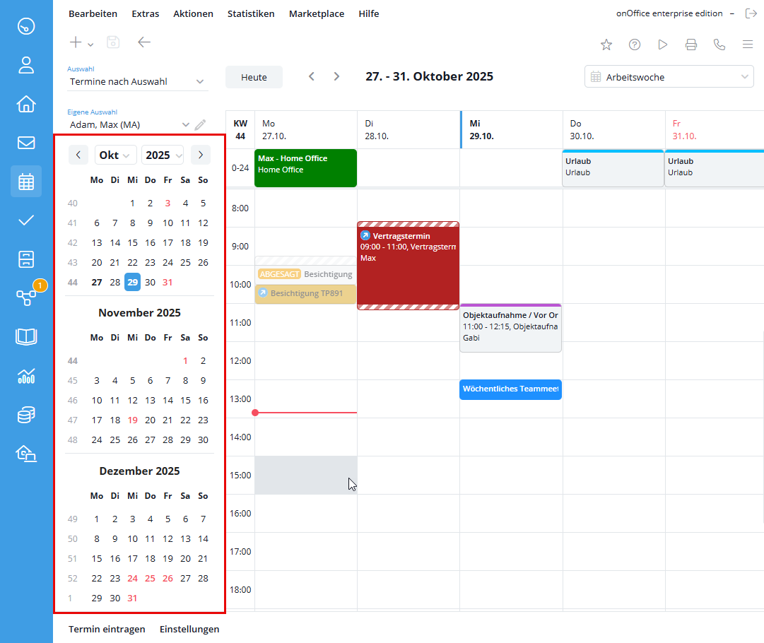
Here you can set which appointments are displayed. Please note that the view depends on your user rights.
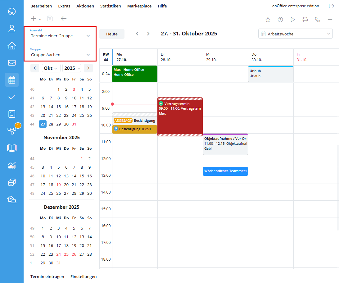
The coloring can be done by user or appointment type, this is adjusted in the settings .
In order to clearly delimit the appointments of the individual users, you can create the users in different colors. The colors can be changed via the user settings.
The colors for the individual appointment types can be changed in the administration for the action types.
Here you will find the current month and the two following months as a calendar page. On the top calendar page, you can scroll through the months using the arrow buttons or select the month and year using the drop-down menus and display the respective calendar page for a specific month. Clicking on the respective date in the calendar page takes you to the respective calendar week in the week view default setting and to the selected day in the day view setting.
The selected date is marked with a colored background, the current date is highlighted in bold in the monthly overview.
Dates marked in red indicate a public holiday.
Attention: These can be either nationwide or state-specific public holidays. The different federal states for which a public holiday applies are displayed when you move the mouse over the respective calendar day. Additional settings for the public holidays of other countries are possible in the basic settings .
In the user settings, you can specify whether you would like to receive a daily schedule overview by email. Resubmissions are also displayed.