 Entry
Entry Dashboard
 Contacts
 Properties
 Email
Email Calendar
 Tasks
Tasks Acquisition Cockpit
 Audit-proof mail archiving
 Automatic brochure dispatch
 Billing
 Groups
 Intranet
 Marketing Box
 Marketplace
 Multi Property module
 Multilingual Module
 onOffice sync
 Presentation PDFs
 Process manager
 Project Management
 Property tracking
 Property value analyses
 Enquiry Manager
 Showcase TV
 Smart site 2.0
 Statistic Tab
 Statistics toolbox
 Success Cockpit
 Time Tracking
 Address from clipboard
 Text block
 Customer communication
 External Tools
 Favorite links
 Calculating with formulas
 Mass update
 onOffice-MLS
 Portals
 Property import
 Quick Access
 Settings
 Templates
 Step by step
You are here: Home / Modules / Contacts / List view contacts

Contacts
List view contacts
For better differentiation, active contacts are displayed in “black” and archived contacts are “grayed out/grey”. Only contact records for which the logged-in user has read permission are displayed. You can access the detailed view of a contact record by clicking on the pencil icon  .
.
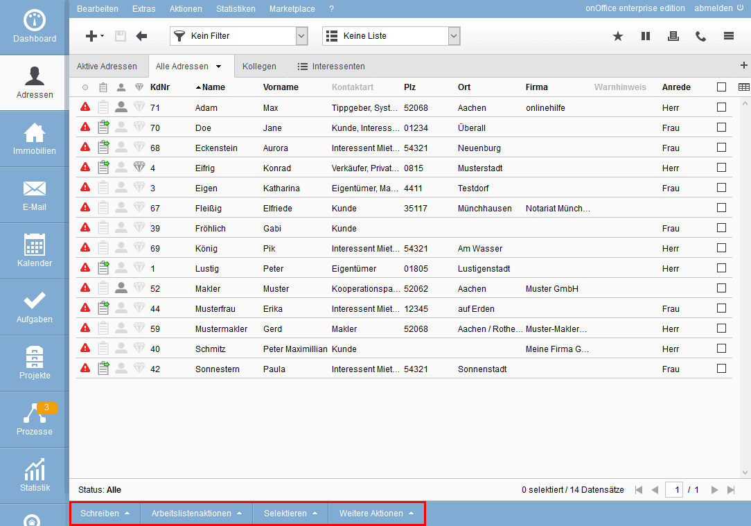
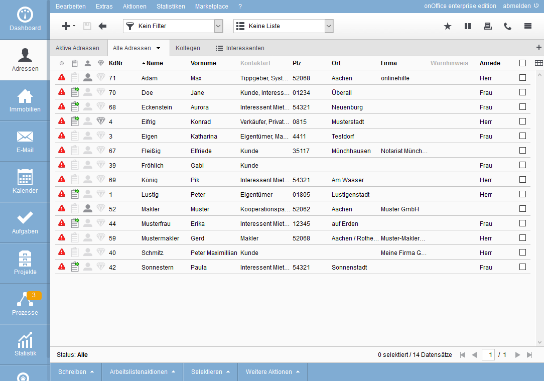
The other elements are arranged around the content area, which displays the contact records:
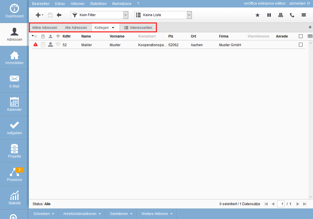
- Toolbar: The toolbar is always visible, but has the additional selections for Contact filter and Work listsin the Contact module.
- Navigation bar: The view parameters for the selected tab are displayed in the left-hand area of the navigation bar, e.g. filter name, worklist name, status, etc.
In the right-hand area, you can see the number of data records displayed in this tab. You can also see how many pages there are, which one you are currently on and you can scroll through the pages using the arrows. - Actions Bar: This is where the possible actions are located. The action is performed for the selected records – those with the checkbox set. How many are selected is displayed in the navigation bar. The contents of the Actions bar change depending on whether you are in a list view or in a contact record.
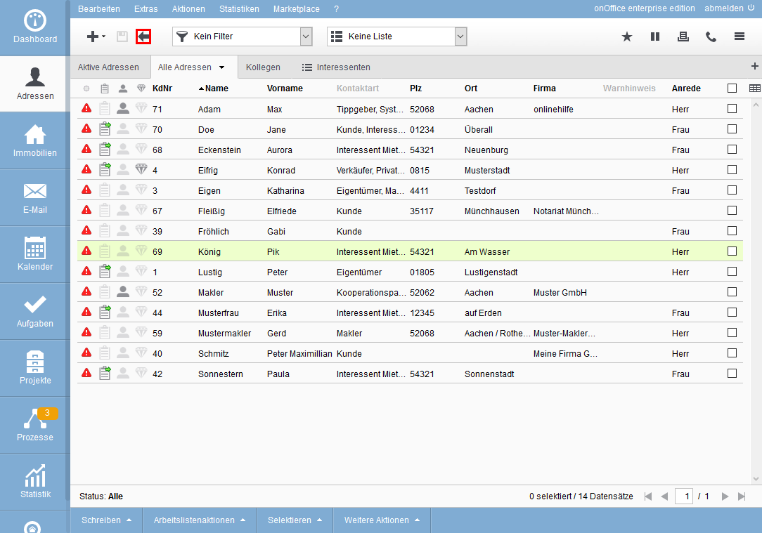
The table view shows the most information about the contacts. The columns displayed can generally be specified in the Administration and then customized per user and per list tab.
The general column configuration for the table view is included in the video (List view configuration) for the general list and column configuration.
The table view sometimes contains graphic symbols; if you “stop” the mouse over the symbol for a moment, an explanation of the symbol is displayed – the tooltip or mouseover. In the column header it contains in general which property is represented, in the column which value the symbol represents.
This works with all columns, so if the content is not displayed in full, you can read the complete text in the tooltip.
You can select individual contact records using the checkbox on the right; you can select or deselect all contact records on this page using the checkbox in the column header. Alternatively, this can be done via the Actions bar.
All actions you perform from the Actions bar are performed only for the selected records.
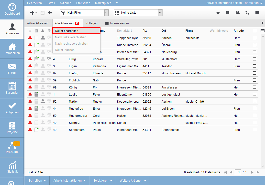
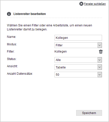
For the table view, open the “drop-down menu” behind the menu triangle  on the right in the current tab and select “Edit list tab”. In “View” you then select “Table” and can additionally specify the number of rows per page.
Please consider: With many lines per page, more data must be transferred, loaded, and then “nicely” displayed by the browser. The latter is usually more time-consuming and also varies from computer to computer. A smaller number of lines will be displayed “smoother”.
You can change the sorting directly in the table by clicking on a column heading. The view is then sorted according to this and a small black triangle is displayed next to the column title. The direction of the triangle indicates the sorting direction. With another click on the same column header you reverse the sorting direction.
Column titles in gray font do not contain sortable information.
The basic structure of the table is specified in the administration. You can customize the columns, their order and the width of the columns to your needs.
You can access the configuration of the columns via the table icon  on the far right of the column headings.
A list will open where you can add the desired fields to the applied fields column by clicking “Add”. You can change the order of the columns by changing the number in the position field before the field name. Simply enter the new desired position and accept it with “Enter”.
The configuration of the column width is displayed via the “Show column widths” option.
The column width can be specified as a fixed number of pixels or as a percentage of the “available space”. The percentage columns are displayed in a different width accordingly when the window size is changed. Depending on the configuration and window size, the column can then “almost” disappear.
Fixed columns have a minimum width of 20 pixels, smaller values cannot be saved.
A more detailed description of the column width configuration can be found in the Administration under Lists.
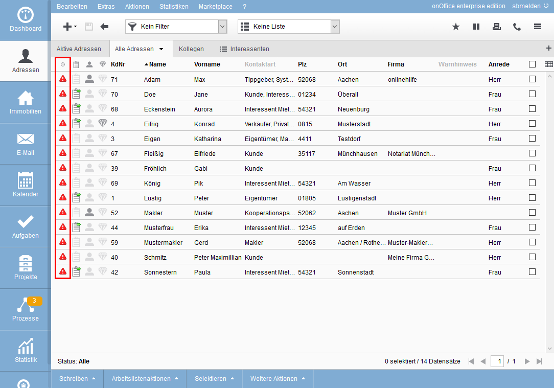
There are special columns such as the traffic light status. This column belongs to the table and cannot be removed. The traffic light color changes the longer the record has not been edited. You can find more details about this in the basic settings.
The magnifying glass and the pen are displayed when you move the mouse over a selected record. Clicking on the magnifying glass of a property record displays the magnifying glass preview. It displays the most important data of the contact. These are customer number, parts of the master data, the supervisor and the last activities.
You can open a contact record from the list for editing or detailed reading. To do this, you can click on the general edit icon or with a click on the line of the Contact record. The Contact record is opened with the “Basic data” tab.
You can return to the table view from the contact data set by clicking the back arrow  in the toolbar. The Contact record that was opened is highlighted in color.
The tile view shows the most important data of the contact record and a picture of the person, if one has been stored in the contact record.
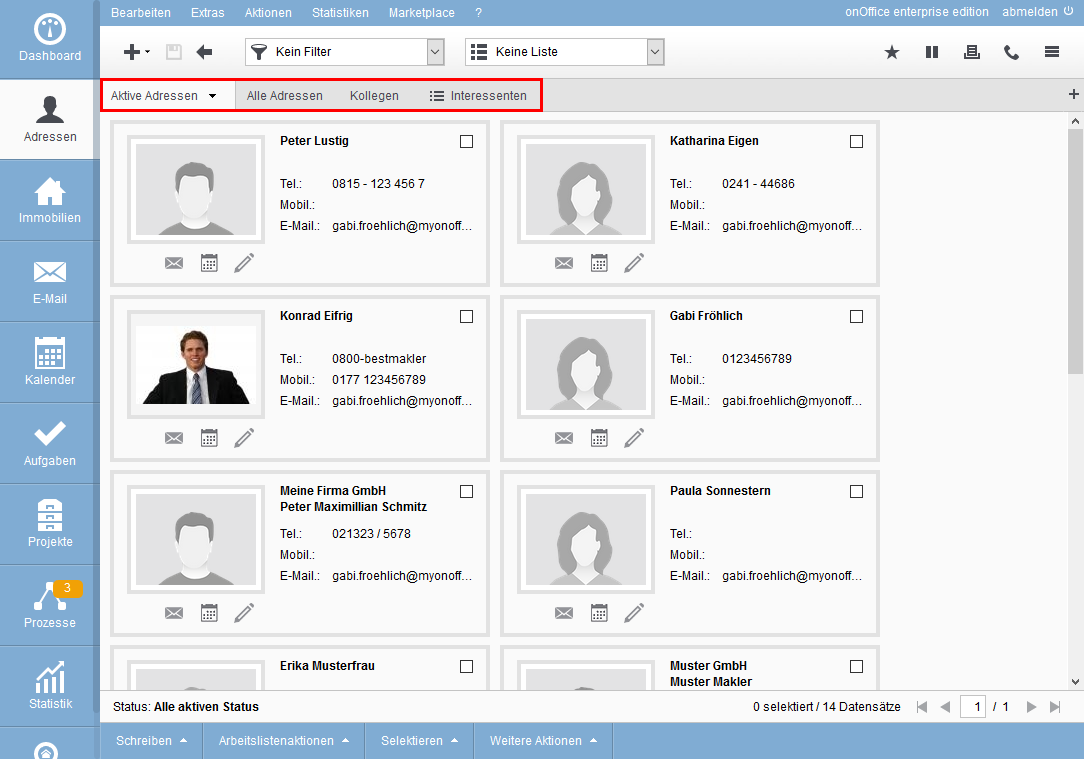
Below the contact photo there are icons for frequently used actions. By clicking on the edit icon you will get to the basic data of the Contact. You can send an e-mail to the contact using the e-mail symbol  . If the e-mail symbol is grayed out, no e-mail address is stored for the data record. With the calendar icon
  you can directly create an appointment.
You can select individual property records using the checkbox at the top right of the tile, and select all tiles using the Actions bar. There you can also deselect all of them again.
All actions you perform from the Actions bar are performed only for the selected records.
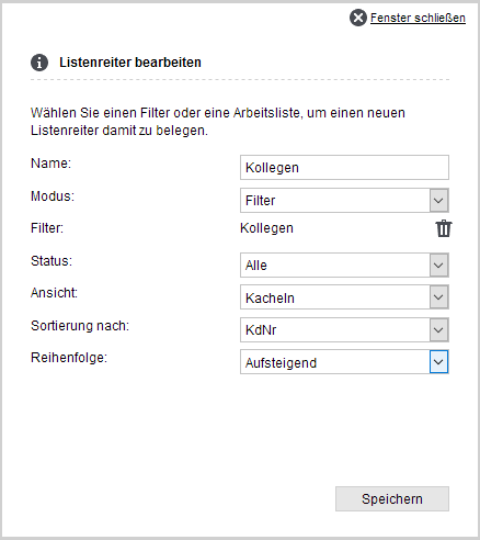
For the tile view, open the “dropdown menu” behind the menu triangle on the right side of the current tab and select “Edit list tab”. In “View” you then select “Tiles”. Below that you can specify by which property to sort and assign the sort direction.
The tile view displays 20 contact records per page.
You can open a contact record from the list for editing or detailed reading. To do this, you can click on the general edit icon or with a click on the line of the Contact record. The Contact record is opened with the “Basic data” tab.
You can return to the tile view from the contact record set by clicking the back arrow in the toolbar. The Contact record that was opened is highlighted in color.
All contact listing actions are clearly available in the actions bar. Please note that you must have selected the desired contact in order to select an action. To do this, simply tick the corresponding Contacts You can also select several contacts at the same time.